
I feel like the 1995 Topps set doesn't get any credit among collectors. While I admit it isn't as good designwise as the home plate-shaped design of 1994 Topps, the 1995 set isn't far behind in terms of design, innovation, and just overall fun. Sure, people wax poetic about 1993 Upper Deck, 1956 Topps, 1975 Topps, 1991 Topps and whatever other sets, but 1995 needs more credit, and I'm here to tell you why.
First off, the design.

The borders almost look like the are ripped or scratched, and there is a shadow element that is the team color. A nice touch by Topps. I like how the team and position are represented as well. I have some issues with the font choice and the choice of a hyphen (-) over a slash (/) when it comes to multi-position players, but I'll address that later.
Second, the photos.


These are just some of the fun photos in the set. I didn't include the Scott Servais triple exposure or the Paul O'Neill 'hit it here' card. Just some fun photos that include posed ones and action shots. This really stood out to me as a 12-year old busting packs of the set in 1995.
Third, the content on the backs.


Let's just start with the interesting bios. Jeff Reed used shaving cream to break in his glove?! Bob Natal got teammate Matt Turner to show up to an empty ballpark on a off day?! Cecil Fielder had his own candy bar?! Daryl Boston did a Stevie Wonder impersonation going through an airport with Pudge and Terrific Tom as bodyguards?! Bo hit a 450-ft HR lefthanded?! Harold Reynolds was honored by President Bush Sr. with a Points of Light award?! Dante Bichette won the 1994 Tucson, AZ foosball championship?! Jose rijo put 5 drops of snake oil on body parts that hurt?! Where did they find this stuff at?! Definitely a lot more interesting than the facts about exit velocity and spin rate the jokers at Fanatics/Topps are writing in the bios in 2023.
I'll admit the 'diamond vision' photo is a little odd and difficult to see, but hey, it was the '90's.

Also props to Topps for labeling the rookie cards on the back by the number.
Just for fun, I decided to try to take the Topps logo off of the card and see if it was a little bit more clear to see everything with.

Fourth, the subsets.

I'll go through these 1 by 1. The Draft Picks was kind of different with the rounded lettering, but the semi-transparent design was cool. I found it odd that Topps gave us a sneak peak of the design in the 1994 Topps Traded set.

I think Paul Konerko thinks so, too.


Future Stars and Star Track cards were basically the same thing, cards for rookie prospects. I always loved pulling these from packs.

On Deck cards featured 2 prospects from the same team. These were cool, especially if you pulled one from your favorite team. They were only featured in Series 2 packs. Of the 2 years that Topps did these 2-card/1 team prospect cards, I think the 1994 version clearly outshined the 1995 attempt.

Why hasn't Topps used this design in Archives yet?!

The All-Star cards were a little weird with just the last names of the players and 1994 TOPPS ALL-STAR yelling at you from the middle of the card in ALL CAPS!!! The backs were a little better with pre and post All-Star game stats. I really wish they didn't put a shadow effect on the card number, because some of them are difficult to read.


My favorite subset cards are the Top Prospect cards. Of the 10 versions of Top Prospects cards from 1992-2001, the 1995 version is my 2nd favorite. I love the border color behind the photo. I love the players level shown in the photo. I love the rainbow effect on the 'Top Prospect' lettering. I even love the blue 'lazer' lines behind the photo. It just screams '90's and technology/computers. Well, maybe not as much as the 1994 Topps Future Stars design...

The funny thing about this design is that my sisters didn't even notice the green 'inside of the internet' portion of the card. They noticed the squares in the photo that looked like bathroom tile and would always call these cards 'bathroom cards'.
Back to the 1995 Topps Prospect card, I like how they notate the rookie cards again, I just wish there was a different background photo so the stats/bio were easier to read and that they didn't restrict it to a certain position for each card. We could've got a huge card with Mariano Rivera, Derek Jeter, Vladimir Guerrero, and Andruw Jones on it had Topps had a crystal ball. With that being said, yeah, the 1995 design is great, but still falls 2nd in comparison to the 1994 beauties...

I just love the ribbon on the top, the red/white/blue/yellow color scheme, the intertwined diamonds, clouds in the background, position and level being listed. Just a beautiful card.


I figured I would show some subsets in the 1995 Topps Traded set as well. They had 3 of them. At the Break showed leading players and their 1995 stats before the All-Star break. There was another All-Star set. Lastly, a 1995 Rookie of the Year candidate subset, featuring leading rookies. In my opinion, the ROY subset was the best, but all 3 of them look to me like they should've been featured in the 1996 Topps set with their designs.
Fifth, the inserts.


I accidentally put this Babe Ruth 100th birthday card in the photo even though it was just a 1-card subset. Kudos to Topps for putting the effort in. The really cool insert were the Finest inserts inserted in Series 2 packs. They were like 1 in 24 packs, and my gosh, are they beautiful! Colored with team colors, a diamond background, all of the chrome technology. I wouldn't have even cared if it had a back in 1995. I somehow pulled this Albert Belle out of a pack in 1995, and I'll have to track down some more.


About 1 in 6 packs (I think) were League Leader inserts. These cards just highlighted guys who were in the top 5 of various catergories and they had bar graphs and standings on the back. I really loved the fronts as the background was blacked out, and in some cases, parts of the background appeared like it was smoke.


I'm saving the best for last with the Cyberstats/SpectraLight cards. Aparently Topps was going to issue these cards as a parallel and call them 'SpectraLight' cards and it was just going to be a parallel with a normal back. Then the 1994 strike happened, and Topps ran a computer simulation to finish out the remaining 1994 MLB schedule, and decided to put the results on the back of the SpectraLight cards. They called them 'CyberStats' on the back, but the packs had them listed as SpectraLight.

Heck, my friend Sawney did the write up for an ad that appeared in Sports Illustrated in 1994, and it listed them as CyberStats, so I don't know what Topps wanted to call them for sure.

My only complaint with this set is that only part of the set is covered, as well as the lack of full stats. 660 cards in the complete set, and only 396 Spectra/Cyber cards.
I wish Topps would've did the same thing in 2021. The 2020 season didn't start until July, and we all know that many of these players will be short a half a season of stats when the Hall of Fame comes calling. The 2021 set would've been perfect to use another sim and issue the cards as parallels. I would've tried to complete it.
Now, for the greatest thing in the 1995 Topps set....The CyberStats Season in Review cards. These cards were issued in the complete set, so it took until 2006 or so before I was able to track down the cards on COMC. Now I have the set, and let me explain why it is so great.

 While the '95 Topps SpectraLight Bonds does tell us that he hit 61 HRs in 1994 with the computer-aided stats, it doesn't tell us what the back of the Season in Review card does: HE HIT 4 IN A GAME VS. COLORADO! Let's imagine that the '94 season didn't end and the Spectra stats were real. That would mean Bonds has not only the single season (73) and career (762) HR records, but also a share of the single game HR record (4)! Matt Williams, who had 43 when the season stopped, would only get to 51 on the season, and the Bonds Season in Review card also shares that Tony Gwynn hit .391, falling short of .400.

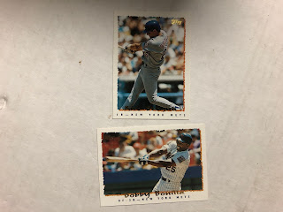 Also, you might not be able to see it, but on the Bonilla card, he has 2 positions listed, but there is a hyphen (-) in between them, and another one between the last position and the team name. I just think it would look better with a slash (/) inbetween the 2 positions and a hyphen (-) between the positions and the team name.
 How do guys like Freddie Benavides and Bob Zupcic get into the set, but then you shorten it to 660 cards? I understand the strike, but by the time the checklist for Series 1 is out, the strike was already going on. Why not take out backup guys and put in more stars if you know the set isn't going to be big? If you are going to put backup infielders in the set, why not everyone? Put them in the Cyberstats insert as well. They wouldn't listen to set collectors in 1995, so why should they in 2023?


The regular Spectra cards also don't tell us that the AL West title came down to a 1-game playoff against the A's, which the Rangers won, thanks to 2 HRs by Jose Canseco, who finished the year with 50.
 For those of you wondering about the World Series, the Indians beat the Braves in 7 games, and Kenny Lofton won the World Series MVP award. In a sim that I did, the White Sox beat the Reds (I believe in 7 games), and Ron Karkovice won the MVP by hitting 3 HRs in the final game (Tony Gwynn also hit .400).

That is just about all I have to say about the great 1995 Topps set. There are a few inserts I didn't cover like 1st Day Issue Stadium Club cards, but I never pulled them, and they weren't Topps cards, so no biggie.
I do have a few bones to pick with Topps on the set. First, the font (called ErikRightHand) is kind of weird and hard to read behind the scribble shadows. Maybe they could've just went with a white or yellow colored font, and just had the Topps logo in foil. Heck, they do that in 2023.

As stated before, the issues on the back with the Topps logo and Diamond Vision photo.
Lastly, player selection and lack therof.

I hope you enjoyed this tribute to 1995 Topps! It really is a great set and has some great photos, back bios, subsets, and inserts, and you should pick up a few cards for your player/team collections, or just do what I did and purchase a whole set.
Thanks for checking out my latest post
-Jeremy
Great rundown and memories. In my first collecting life I remember putting this set together from wax. in my current life I just got the factory set. Memories of days gone by and definitely a 90s set, but not in your face as so many other that year.
ReplyDeleteWhen you compare it with the 95' Fleer, Topps looks like the Homecoming Queen
ReplyDeleteI liked this set earlier in my blog days enough that I thought about completing it. I'm not as high on it anymore. I think the unreadability of the player names and the fact that there are so many redundant prospect subsets killed it for me. Still like it better than '93 and '94 Topps though.
ReplyDeleteNice write-up. I collected the basketball version as a kid, but had stopped collecting baseball by that point so I didn't see a lot of these until I started reading the blogs. Lots of neat photos to be sure, and I love the Spectralight parallels.
ReplyDeleteFun post! Thanks for the research. I too enjoy the 1995 set.
ReplyDelete