
Yesterday I randomly searched ‘2023 Topps design’ as I do periodically around July every year in order to see if there was any news on the new design yet. I didn’t expect to see anything, and after scrolling down at least 50 images, I came across a Tweet that Topps had made that very day promising the 2023 design would be unveiled today. I searched again during my lunch break and the image was indeed out. I’ll post it and then give my thoughts.

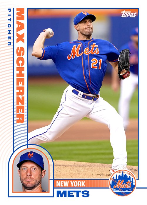
I don’t know what to say. I think I like the angles somewhat. I don’t see the need for the huge logo or the additional photo in the huge logo. Maybe a logo about 1/3 or 1/4 of the size and have the nameplate and position under it at the bottom would’ve worked better. It gives me feelings of the horrible 2016 design that was all scoreboards and like some previous designs it’s too angle-y. It even reminds me of some custom designs I’ve seen before. I remember in like 2010 or so (before I was even really making customs), I came across a website of some guy who made custom cards that were right up there with Topps designs and that I could’ve pictured the company using. Unfortunately, I have no idea if the site is still around, but the ‘23 design almost comes off like a custom maker designed it and not a graphics department. It doesn’t really even seem to me like the Topps graphics department (or whomever was making designs the past decade or so) designee it.
While also looking for blog posts seeing what others thought of the design, I came upon this one, which was written a few weeks before the design came out. The post basically notes how every 20 years, Topps makes a design with an additional photo on the front. Ross, the writer, make 4 custom designs that he thought might be close to what Topps would make should they choose to go that way. I feel like Topps may have seen this post and combined some of the elements, especially the scoreboard type logo from the first design and the slashyness in the second one.


Thanks for checking out my latest post.
-Jeremy
I kinda like it. Reminds me of something I'd see on a Jumbotron at a ballgame. Seems a lot cleaner than the 2016-17 fiasco(s) that haven't grown on me at all.
ReplyDeleteI like the fronts.
ReplyDelete