I was able to get my hands on some 2024 Topps today, and it is totally different in hand. Parts of it impressed me, and other parts frustrated me. Let's take a look.
Fitting as my first card of the 2024, I got card #1, Ronald Acuna, Jr.

The back of it. I guess I'll start with the negative stuff first so I can end on a positive. I feel like the back has too much white. Maybe a picture could've made it better. Feels like the back of a '97 or '98 Score card. the fonts are way too small in some areas. I can read his name, barely read the team name, the position is about at my breaking point, and the Height/Weight/etc. is unreadable unless I bring it close to my eyes or take my contacts out. The stats are at that unreadable font size, but it's not the case with all players. The bio underneath the stats is perfect. If they would've left that font size for everything, it would've been perfect. The last issue I have is the color bar that has the stats on it. For many teams with a lighter color, the color bar makes the stats unreadable. For teams with a dark color, you can easily see the white color of the stats. With a few changes, this could be a great back, like some of the Big League backs in recent years.

Theres a comparison of a light colored stat bar with a darker one. See the difference?
I purchased a jumbo pack. Nothing earth-shattering, but it helped scratch the itch and get me a sampling of the inserts. Unfortunately for me, I got one of that over-rated Yankee Jeter. Pete Alonso was in a 2023 highlight-ish insert, and I pulled an '89 redux of Luis Robert. Kudos to Topps for sticking with the White Sox colors from the original 1989 set. I got a decent selection of the 30 teams, missing a few, but getting most of them.
I was hoping to pull the Rays League Leader cards, especially the one comemmorating Yandy Diaz's batting title.
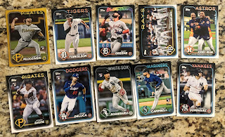
The last insert I pulled must've been a rainbow foil card of Pirates rookie Carmen Mlodzinski. TCDB doesn't have the main checklist or parallel ones up yet, so I wasn't able to log anything in. I was hoping they would have picture of some of the rainbow parallels up, because I really thought the card was a gold parallel because of the border color. It doesn't have a serial number, so I would have to assume it is a rainbow. I got 2 Tigers, Spencer Torkelson and Riley Greene, 2 guys I hope play 162 games and rake in 2024. I'm happy with pulling the Rays team card, as it features an awesome shot of Randy Arozarena and the team. The no-hit Valdez card was a nice surprise, and will go in my highlight binder. I pulled some of the key rookies with Henry Davis and Jasson Dominguez. As much as I can't stand Yankee$, at least if Dominguez is as good as they hype him up to be, this card might be worth a little. I believe DeLuca was one of the guys the Rays got in the Glasnow fleecing. Hopefully him and Pepiot make the trade worth it. At least they got rid of no-hit/decent field Manuel Margot.
Not a knock your socks off pack, but I think I got some decent cards. What impressed me was the printing technology. Pictures from their sell sheets as well as the ones I've taken and posted don't do the fronts justice. There is some kind of unique, almost foilboard technology running along the neon parts of the card. You can really see it if you hold it up to the light, and it is also very visible on Future Star cards. If your fingers aren't too rough, you can almost feel a raised area where it is, especially along the team names. Just a nice touch and really makes those areas of the card almost glow. Definitely give it a look when you get your hands on a pack.
I'm in the process of making a trade of some 1993 Fleer cards for some random Topps needs. I might get some cards from a cheap common site to finish off a few sets as well, so hopefully that will happen in a few weeks. I finished the White Sox and am working on putting the Indians/Guardians into TCDB. Didn't get as far as I had hoped last week, but I spent some time cleaning and was digging 200+ Fleer cards out of binders/boxes, so that took some time. No more off days this week, so I'll be happy with getting to the mid '00's in my Cleveland binders done.
I hope you enjoyed your first look at 2024 Topps. Thanks for checking out my latest post.


Love how this set looks, but I doubt I'll look for any until the weekend at the earliest. I wish, though, Topps would tone it down on the city connect uniforms. Some of them are very bad and it hurts those cards.
ReplyDeleteI broke one hobby box last night (Tue. Feb. 13th) on the TCDb forums and just finished breaking another hobby box today (surprisingly my order from Topps arrived a day before the official release). The first box was really good (two autos!) while the 2nd one was meh. But I really love the look of the base cards. imho, Topps stepped up it's game with the nightclub neon shine and the photography. I agree there is too much white on the backs. But have you seen the backs of the League Leaders cards?
ReplyDeleteI'm loving this year's design - my favorite in a long time. Though I do agree with Night Owl - seems like Topps went a bit overboard with the "City Connect" jerseys (and that's coming from someone like myself who actually likes most of 'em). Either way, hoping to get my hands on a box tomorrow!
ReplyDelete👍
ReplyDeleteJust went to WalMart and they didn't have any, not that I probably would have paid full price anyway. Did snag a couple of blasters of 2023 Heritage at $16.98 each, so yay! Hopefully will buy a bunch of the new set at the show this weekend.
ReplyDeleteI am still holding off on the release. I do like it though, and it has been a long time since I could say that about flagship Topps.
ReplyDelete